
That sinking feeling…
I am taking a photography class and it has been fun (I originally typed “phun”, I like it) and this week we are supposed to take a Pantone color and match it to something and photograph it and then talk about what the Pantone color of the year is. You may wonder what Pantone is? It is a company in New Jersey who is known for standardizing colors in a repeatable way. I had always wondered because in previous lives I had occasion to have signs made for various things, such as compressor stations or new offices and whatever company I was working for would send the sign design and the colors were just listed by numbers and I would ask, how do you know they will get it right and they told me not to worry about it, a good print shop will get it right. And sure enough they did whether it was British Petroleum Green, Shell Oil Yellow, Lear Petroleum Aggie Maroon, Champlin Petroleum Red, or Mobil Oil Red. They always got it right.
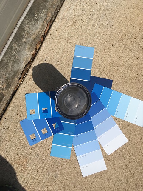
Great pic, except you can’t see the object I am trying to match.
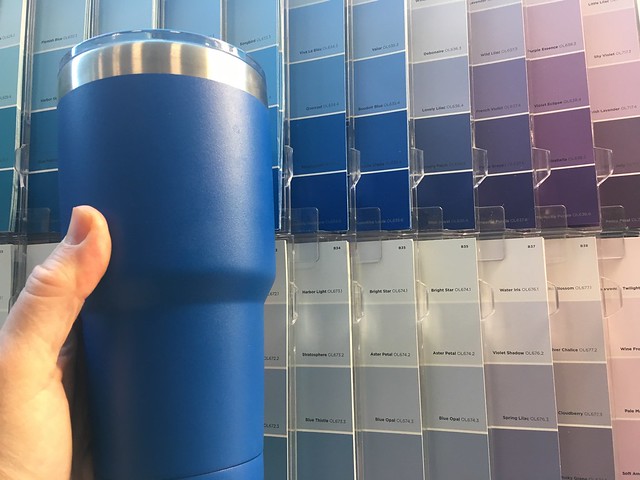
Anyway I had a problem because I lost my assigned paint chip which was some sort of bright pinkish red so I decided to work things backwards and take an object and find the Pantone equivalent. Smart plan right, well guess what I couldn’t find the Pantone colors. So being the problem solver that I am I just went to Lowes with my Yeti and found the color among what they had that matched the object as close I could get it. They had several displays of different paint chips and I tried to get as close as I could. I tell you what matching colors is tiring and frustrating. Some colors that seemed close, didn’t seem so close later. They all look different depending on the light it is in.
This was taken with my cell phone. Looks like several matches.
I know people who are good at matching colors and it is magical. Once they do it, I can see the match but I can’t come up with it on my own. Often it seems counterintuitive but it works. I guess that I’ll stick to my day job.
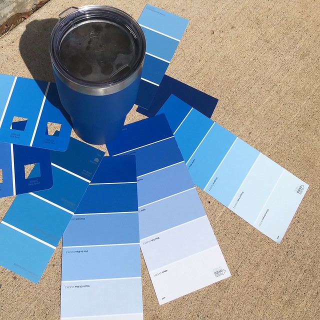
Taken with my fancy schmancy Nikon D5300 with full sun whitebalance. This color looks lots less dark than the above photo.
i
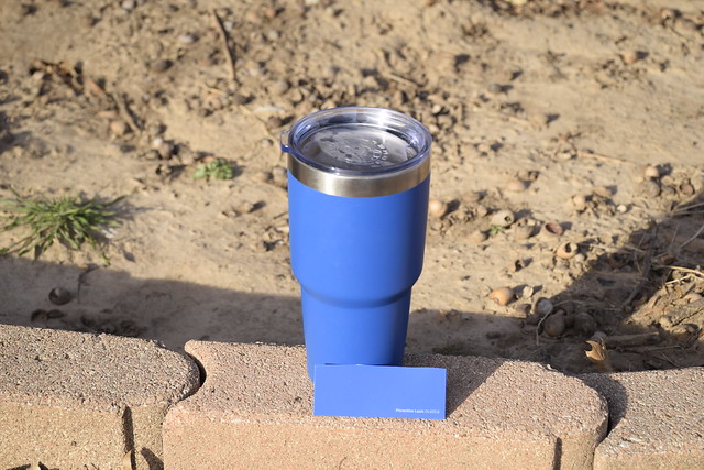
So the winner, after much worrying and sweating is Olympic Paint’s “Florentine Lapis” number OL635.6 and I am not happy with it. Color is difficult. I pick out what I think is closest and it doesn’t quite photograph right despite taking the photo outside with the white balance adjusted. Color problems drive me crazy. You got how it looks to my eye, and then what the camera sees, and then what the monitor displays to you when you look at my photo.
Do you have a good eye for color? Tell me about it, because I don’t.
And as a bonus here is a link presenting Pantone’s color of the year.
PANTONE 18-3838 ULTRA VIOLET!
from the page: “…Complex and contemplative, Ultra Violet suggests the mysteries of the cosmos, the intrigue of what lies ahead, and the discoveries beyond where we are now. The vast and limitless night sky is symbolic of what is possible and continues to inspire the desire to pursue a world beyond our own.”
Now you know all the secrets!! The color Violet is the solution to all our problems.
Intriguing post about color for photography class ~
Happy Week beginning,
A ShutterBug Explores,
aka (A Creative Harbor)
Purple….any shade is my favorite! It’s the color of royalty. Violet is purple. But I’m thinking…royal…as in me…a royal pain.
Your ble chip is a few shades lighter than your Kodi mug.
Ble is ‘blue’
I think I will fail terribly! Lol!
I am pretty good at matching colors and I have used the Pantone chart before. Still, my wife is much better at selecting colors. And yes, the light source makes all difference in the world. Sunlight vs. incandescent, vs. LED, vs fluorescent (cool white, warm white, daylight white). It can be certainly be a challenge, but it looks like you have hit the nail on the head here. Congratulations.
Pantone, I learned something new. I like paint chips but can’t imagine trying to match something I own to them. Isn’t that way the paint mixers have a camera like thing for matching. I guess too much cheating even for you. I’m enjoying your class.
I actually had trouble moving on from thinking about how photography is phun. I wonder if the latter is acceptable in WWF. Anyway ….. the contractor who did the addition to our tiny home here wouldn’t let Bill pick out the color for the tile grout (after we’d chosen the tile itself) because he said men didn’t have the eye for color matching that women have. I wasn’t home at the time and he actually made another trip on a day when I was. (I picked the same one Bill said he would have. We think it looks OK. ) The daily paper here has a big feature every year on Pantone’s new color of the year — as if they expect everybody to redecorate accordingly. Heck, for all I know all those zillion dollar homes on the beach maybe do just that.
I never knew too much about colors until I started painting. Who knew that snow is really shaded of blue or purple rather than white. Flesh color is a mixture of blue, red, yellow and white. Just today I bought myself a new color wheel with hundreds of tints and recipes for what colors to mix to achieve the desired result. It looks like your class is really detailed and interesting.
So blue-tiful!