That sinking feeling…
I am taking a photography class and it has been fun (I originally typed “phun”, I like it) and this week we are supposed to take a Pantone color and match it to something and photograph it and then talk about what the Pantone color of the year is. You may wonder what Pantone is? It is a company in New Jersey who is known for standardizing colors in a repeatable way. I had always wondered because in previous lives I had occasion to have signs made for various things, such as compressor stations or new offices and whatever company I was working for would send the sign design and the colors were just listed by numbers and I would ask, how do you know they will get it right and they told me not to worry about it, a good print shop will get it right. And sure enough they did whether it was British Petroleum Green, Shell Oil Yellow, Lear Petroleum Aggie Maroon, Champlin Petroleum Red, or Mobil Oil Red. They always got it right.
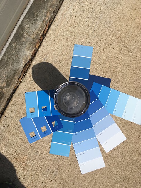
Great pic, except you can’t see the object I am trying to match.
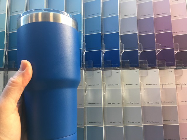
Anyway I had a problem because I lost my assigned paint chip which was some sort of bright pinkish red so I decided to work things backwards and take an object and find the Pantone equivalent. Smart plan right, well guess what I couldn’t find the Pantone colors. So being the problem solver that I am I just went to Lowes with my Yeti and found the color among what they had that matched the object as close I could get it. They had several displays of different paint chips and I tried to get as close as I could. I tell you what matching colors is tiring and frustrating. Some colors that seemed close, didn’t seem so close later. They all look different depending on the light it is in.
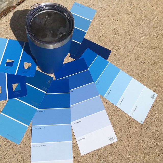
This was taken with my cell phone. Looks like several matches.
I know people who are good at matching colors and it is magical. Once they do it, I can see the match but I can’t come up with it on my own. Often it seems counterintuitive but it works. I guess that I’ll stick to my day job.
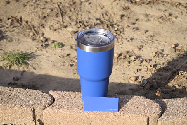
Taken with my fancy schmancy Nikon D5300 with full sun whitebalance. This color looks lots less dark than the above photo.
i
So the winner, after much worrying and sweating is Olympic Paint’s “Florentine Lapis” number OL635.6 and I am not happy with it. Color is difficult. I pick out what I think is closest and it doesn’t quite photograph right despite taking the photo outside with the white balance adjusted. Color problems drive me crazy. You got how it looks to my eye, and then what the camera sees, and then what the monitor displays to you when you look at my photo.
Do you have a good eye for color? Tell me about it, because I don’t.
And as a bonus here is a link presenting Pantone’s color of the year.
PANTONE 18-3838 ULTRA VIOLET!
from the page: “…Complex and contemplative, Ultra Violet suggests the mysteries of the cosmos, the intrigue of what lies ahead, and the discoveries beyond where we are now. The vast and limitless night sky is symbolic of what is possible and continues to inspire the desire to pursue a world beyond our own.”
Now you know all the secrets!! The color Violet is the solution to all our problems.