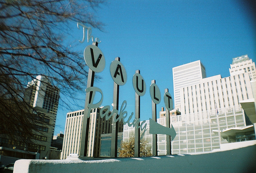
The Vault is a new restaurant in downtown Tulsa that opened up in a re-purposed motor bank. It has a mid Century Modern theme. I don’t know if the food is any good but I love their sign.
Signs, Signs


The Vault is a new restaurant in downtown Tulsa that opened up in a re-purposed motor bank. It has a mid Century Modern theme. I don’t know if the food is any good but I love their sign.
Signs, Signs
hee hee…
«Louis» likes the sign, too! He likes all things Retro, so he would like to check this restaurant out…
«Louis» hopes the New Year is off to a good start for you!
I love the “Gorge Jetson” look of the signs from the late forties and early fifties. This is a nice nod to that period.
so they serve retro food or its just the decor? Annoying literal minded comment leavers need to know 😉
My guess, from simply looking at that sign, is the food will be expensive (but good). Just shows what signage “says” to the viewer.
The sign is perfect for a bank turned eatery. You’ll have to check it out and tell us if it cost’s a king’s ransom to eat there.
I like the blue sky! We have a repurposed eatery called The Bank in Denver – went into it once and it was so smokey, went right back out. (However, there are smoking bans since then, but still can you ever get rid of that smell?) See what your photo made me think of!
An impressive sign by day, but I wonder if it needs some kind of spotlight by night! An interesting one!
Cool style.
Beautiful sign yes! Funny, there was a restaurant by the same name in a small town near us in Oregon also (surprise) built in a renovated old bank building. It was in Harrisburg Oregon, but I don’t think it is there any more. Hope yours does better.
There is something very retro looking about the sign. I like it, too. genie
Love the sign, and I agree that it looks like it would be expensive!
I love signage. Lots of fun!
Cheers from Cottage Country!
Fun how such a simple looking sign makes us think of expensive place to eat. Now you’ll have to follow up and let us know.
Reminds me of a lot of 50s signs!
That is a neat sign and it makes me wonder what the restaurant looks like.
A great combination;-)
I like that sign, too.